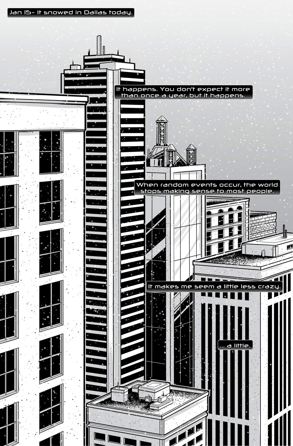
Snow Day -- Monday, May 13, 2013
Honestly, one of the best things about the webcomic format is that you can kind of do whatever you want. There are no hard and fast rules about the way you have to do things, and the rules that do exist are pretty arbitrary. When we set out, we didn't really want to make this a typical strip-based comic, but we wanted the option to be able to turn it into a printed book later without ruining the format.
This let us do some pretty interesting things with the panel layouts and the view, especially since we have the automatic assumption that people are going to be scrolling as they read.
This first page makes use of some of that opportunity. It's one of the few ones where the visible boundary of the comic comes into play. The black gutters are designed to fade into the background of the site, so in this case the stark white corners are visible. This gave us the chance to show the navigation buttons slightly overlap the top of the comic, which was an important part of the design.
When the site first launched, the bottom navigation buttons were not available, but realizing that the comic would be read from top to bottom, we figured it'd make a lot more sense to give the user the ability to navigate after reading a page.
We also wanted to add these news posts, but we weren't sure how to keep it from pulling focus from the comic, so as you can see we made them appear only if you choose to view them. Being a pair that knows each other pretty well, it's actually been kind of funny: as the writer I've always been the kind of person who reads every bit of bonus content available. I'm probably one of the 12% of people who actually read all the articles, news clippings and so forth that came between the issues of The Watchmen. Danielle is exactly the kind of person who can't stand to sit through the extended version of things, or listen to the commentary on tv shows. But it's these little differences that make the comic better: variety is life and all that.


